
Restaurant Branding: How to Build a Brand Identity Guests Remember
Restaurant branding is everything a guest sees, reads and feels about your venue. Here is how to build a brand identity that holds together, from the logo to the menu in their hands.
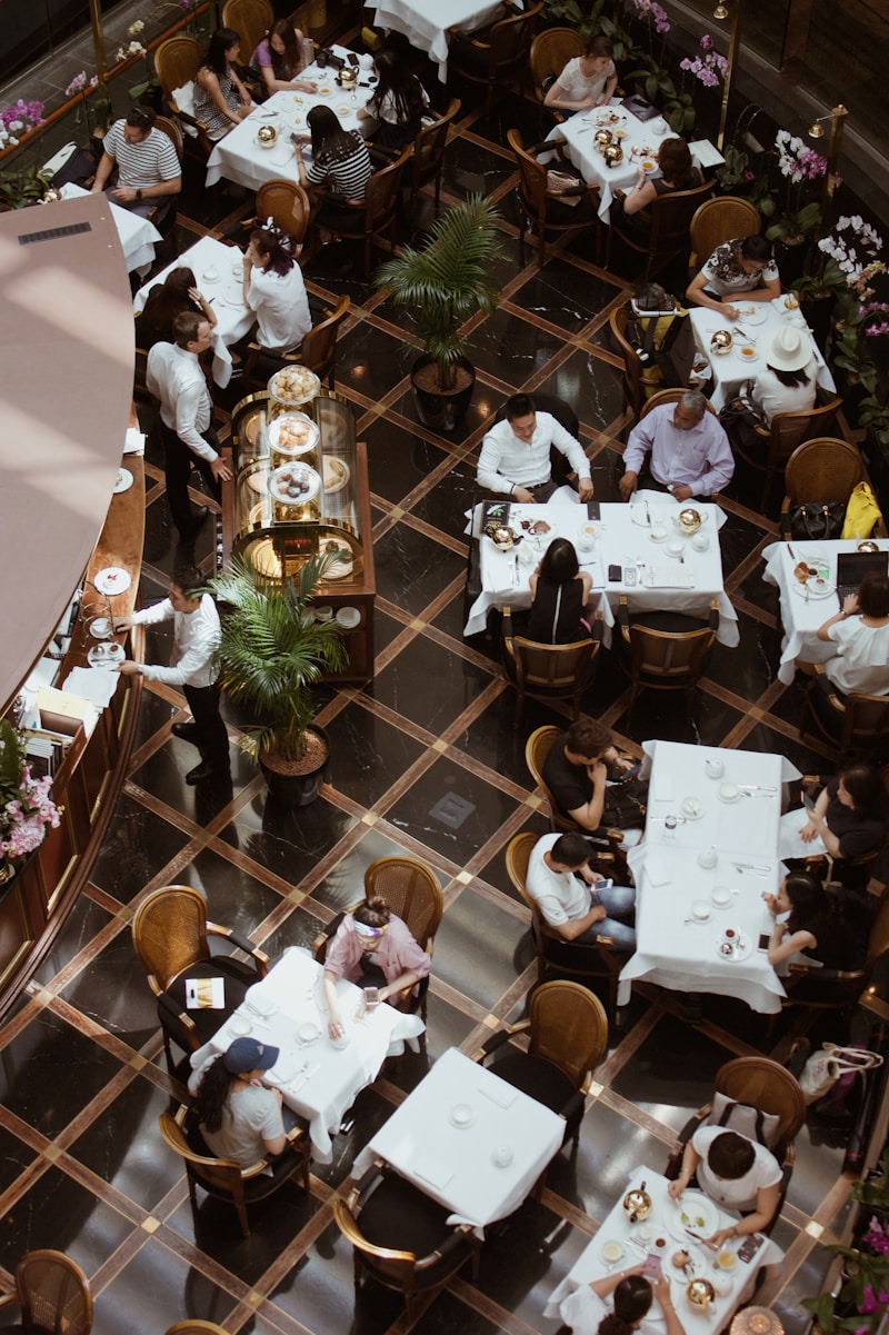
Restaurant branding is the sum of everything a guest sees, reads and feels about your venue: your name, logo, colours, tone of voice, interior, service and menu. A strong brand identity makes those pieces agree with each other, so guests remember you and know what to expect before they arrive. This guide is written for owners, not designers: what to decide, in what order, and where most restaurants lose the thread. One piece gets its own section, because it is the part of your brand every guest holds in their hands, and the only part you can change in seconds: the menu.
What restaurant branding includes
- Identity: your name, logo, colours and typefaces.
- Voice: how your menu, signs, social posts and staff talk.
- Experience: the room, the music, the plates, the style of service.
- Touchpoints: every place a guest meets you, from Google Maps and Instagram to the table stand and the bill.
Guests do not judge these separately. When the Instagram looks like a fine-dining room and the menu looks like a photocopy, they notice that something is off, even if they cannot say what.
Step 1: Define your restaurant's personality
Before you choose colours or fonts, write one sentence about who you serve and how you want them to feel. "A neighbourhood trattoria where families feel at home" leads to different decisions than "a cocktail bar for a night out". Then place yourself on a few scales:
- Casual or formal: a family pizzeria and a fine-dining room both need branding, but completely different approaches.
- Local or cosmopolitan: do you lead with regional roots or international influences?
- Playful or refined: this sets your tone, your colour palette and the language on your menu.
- Everyday or occasion: a place guests visit weekly is branded differently from one they save for birthdays.
Check every later decision against that one sentence. It is the cheapest brand tool you will ever have.
Step 2: Choose colours that fit the food
- Red and orange: energetic and appetising. Common in fast food and pizza.
- Green: freshness, health, sustainability. Natural for farm-to-table and vegetarian kitchens.
- Black and dark tones: luxury and exclusivity. Often used in fine dining and cocktail bars.
- Warm neutrals (beige, cream, brown): homely and welcoming. A good fit for bakeries, cafés and casual dining.
Pick one main colour, one accent and one neutral, and write down the exact colour codes. Your printer, your designer and your digital menu should all use the same three, or the brand slowly drifts apart.
Step 3: Keep typography simple
Most restaurants need two typefaces at most: one with character for the name and headings, and one plain, highly legible one for everything guests actually read, such as dish names, descriptions and prices. On a phone, legibility beats style. A thin script font that looks elegant on a sign becomes hard to read at small sizes in a dim room.
Step 4: A logo that works everywhere
- Keep it simple. It has to work on a QR code stand, a business card and a round social media profile picture.
- Use no more than two colours in the main version.
- Make sure it reads in colour and in black and white.
- Avoid clip art and generic icons such as a fork, a spoon or a chef's hat.
Step 5: Find your voice
Your voice is how you sound in writing. A seaside grill can write "caught this morning, grilled over charcoal"; a fine-dining room might write "line-caught sea bass, beurre blanc". Neither is better. What damages a brand is mixing them: a playful Instagram, a stiff menu and a formal website read like three different restaurants. Write down five words you would use and five you never would, and give that list to whoever writes your menu, your posts and your signs.
The menu: the brand piece every guest holds
Guests spend more time with your menu than with any other part of your brand. They read it at the table, often twice, and more and more of them read it on their phone before they arrive. That makes it your most viewed brand touchpoint. On paper it is also the hardest one to keep right, because a printed menu freezes your design, prices and wording until the next print run.
A digital menu removes that limit. With doXmenu the menu carries your own logo, colours, fonts and background, so it reads as part of your restaurant rather than a generic template, and you can adjust wording, photos and prices in seconds as your brand evolves. Whether your menu is printed or digital, check that it has:
- the same colours and typefaces as your sign and website;
- dish names and descriptions written in your brand voice;
- photos with one consistent look: the same background, light and angle for similar dishes;
- a QR code stand or sticker that suits the table, not a random black and white printout.
Your digital presence
For many guests the first contact with your brand is not the door. It is Google Maps or Instagram. Use the same name, logo and cover style everywhere. In your Google Business Profile, add real photos of the room and the food, keep opening hours current, and add a link to your menu so guests can read it before they decide. Put the same menu link in your Instagram bio. Two or three posts a week is enough to look alive.
Branding on a small budget
- Spend on the logo first. A clear, simple mark lasts for years.
- Fix your colours and typefaces on a one-page style sheet before you print anything.
- Photograph your own dishes in daylight instead of using stock photos.
- Put your menu online, so design and wording updates cost nothing.
- Rebrand in stages: sign and menu first, uniforms and packaging later.
A 10-minute brand audit
Open your Google listing, your Instagram, your website and your menu side by side, and check:
- Is the name written the same way everywhere?
- Is the logo the same file everywhere, not a stretched or outdated version?
- Do the colours match?
- Do the prices on the menu match the prices online?
- Would a stranger guess the same price level from all four?
Every "no" is a place where guests get mixed signals. Fix the menu first, because it is the one every guest sees.
Frequently asked questions
What is restaurant branding?
Restaurant branding is everything that shapes how guests recognise and remember a venue: its name, logo, colours, typefaces, tone of voice, interior, service and menu. Good branding makes all of these consistent, so guests know what to expect before they arrive.
What makes a strong restaurant brand identity?
A clear personality written down in one sentence, a small fixed set of colours and typefaces, a simple logo that works at small sizes, and one consistent voice across the menu, signs and social media. Consistency matters more than any single design choice.
How does the menu affect restaurant branding?
The menu is the brand touchpoint guests spend the most time with, at the table and often online before they arrive. Its design, wording and photos should match the rest of the brand. A digital menu lets you keep it matched without reprinting.
How can I brand a restaurant on a small budget?
Invest in a simple logo, fix your colours and typefaces on a one-page style sheet, photograph your own dishes in daylight, and put your menu online so updates cost nothing. Rebrand in stages, starting with the sign and the menu.
Want your menu to look like your brand instead of a template? Try doXmenu free for a month, no credit card needed.


